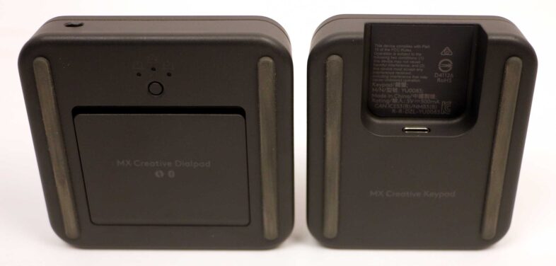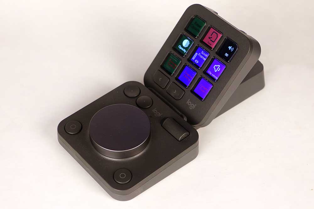
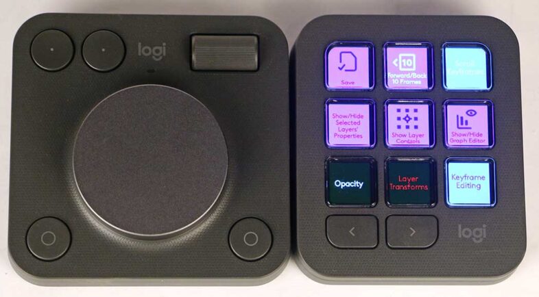
Logitech recently released the MX Creative Console, a new interface device targeting Adobe users. I got the opportunity to see it in person at the MAX conference, and have been testing one myself since then. The device has a rather unexpected design, with two separate parts that are sold together. There is a dial and roller, with four solid buttons, that connects wirelessly to the system via Bluetooth. Then there is a panel of 9 LED buttons, with dedicated next and previous buttons, which connects via USB-C. They are designed to be used together, with the LED buttons displaying and controlling the function of the separate dial, but are independent pieces of hardware. They can each be used by themselves, but they do function more effectively together, and can be set up in a variety of different ways.

 The Hardware
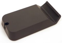
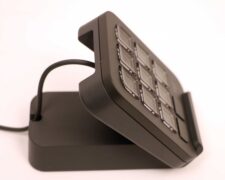
The MX Console comes in a darker ‘Graphite’ option, or ‘Pale Grey’ to better match Apple peripherals. I like the darker option personally, especially for better contrast with illuminated buttons. It also comes with a little stand, designed to prop the button panel up at 45 degrees, so it can be placed at an angle behind the dial if desired, instead of next to each other. It also has a hook on the back for cable management, to secure the USB cable that connects into the center from the top. The dial has an on-off switch to save battery life, and a button to switch between three separate Bluetooth connections, so it can easily be used with multiple devices, potentially supporting Logitech’s Flow functionality. This allows all of your peripherals to switch to a different system when your cursor mouses over to a different screen.
 The Software
Logitech’s professional line of computer peripherals is branded MX, as compared to the G-series gaming focused products. I already have an MX Anywhere 2S mouse, which I bought last year after seeing what Logitech was doing regarding Adobe integration in their MX software at the previous MAX conference. This new device is in the MX line, hence the name, so they are all customized through the same unified Logi Options+ software, and they utilize the same Action Ring that Logitech introduced in its mice last year. At first I was confused by this, because the Action Ring requires a mouse to manipulate the triggered UI, to choose one of the 8 available commands. And since this is already a button on the MX mouse, why would a user want a button for that on the MX console for that, since they must have their hand on the mouse to use it anyway? But then I realized that this feature is included for users who don’t already have an MX mouse. So with any cheap mouse, the Action Ring can be used, if you have the MX Console. But MX Mouse owners will likely benefit from reassigning that button on the dial to a different function.
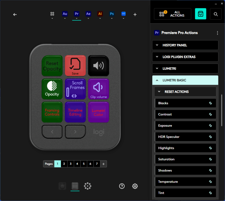 Logi Options+ allows users to do this, (and so much more) with relative ease. The top shows all of the configured application profiles, and the bottom shows each of the supported hardware devices that are (or have been) connected, as well as the Action Ring. And in the center, every button or feature can be customized from a long list of possibilities on the right hand column. This is a giant list, making the search function critical to narrow down what you are looking for as you assign commands. And existing functions can be moved to other buttons simply by dragging them to the intended spot, and the command being replaced will usually swap to the location being moved from. It is more difficult to move commands between pages, and it would be nice to be able to view multiple pages of buttons at once. There is a login function that allows you to sync your settings between different devices, among other benefits. Also, similar to the device itself, the software has a light and dark option. The dark option really highlights the software’s roots from Loupedeck.
Loupedeck Legacy
Loupedeck was acquired by Logitech last year, so this MX Creative Console is the first product to be released that combines the strengths of both companies. In one sense, this new product is basically a trimmed down version of the Loupedeck CT. It has the big dial, and context sensitive, LCD labeled buttons, and a single roller instead of six spinning dials. It is way cheaper at $200 instead of $550, and offers much of the same functionality. It is pre-designed for a “live” version, with just the button pad, which I wouldn’t be surprised to see for sale for under $100 at some point in the future. The dial by itself less so, as it leans on the buttons for its function control and user feedback via the displays.
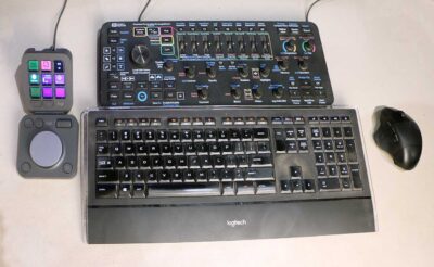 If you are a current Loupedeck user, be warned that the Logi Options+ software for the MX Console is incompatible with the older versions of Loupedeck’s software. It will require moving to version 6, which has very negative reviews online. I made the jump from 5.9 to 6.0.1 in the course of this review process, and after installing the correct plugins, which are no longer included, I was able to restore nearly fully functionality to my Loupedeck+. So it can work, and I know that the Loupedeck support team is working hard to get their software integrated with Logitech’s existing utilities, but it is still a tough transition time at the moment.
 Customizing Function Mapping
There are a dizzying array of options and approaches to choose from when customizing the functionality of the device. It is far more flexible than the Loupedeck+, and it has taken me a while to really wrap my head around all the possibilities that it offers. There are default configurations, but my main complaint with the MX console is the lack of consistency between the default profiles in the various Adobe applications. 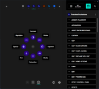 They have this unified Action Ring that can be used in any of the applications, and have done the work to plumb all these different functions in each application, but in After Effects, Contrast is at the top of the ring, while in Premiere it is on the lower right, and in Photoshop it is on the upper right. Why? They all use Contrast, Exposure, Saturation, Temperature, Tint, etc. Why are they not in the same place in each application? So this device is similar to previous Loupedeck products, the hardware is cool, the software is customizable, but the default functionality is not well designed. Now this can be customized, but why should every user have to correct an illogical setup?
Initially I had the same criticism of the default function mappings for the buttons. And while I still think that consistency is valuable when new users are trying to adapt the product, I am less concerned about that after using the device for a while. My original approach was to have some consistency between the different Adobe apps, so the first page could be Import, Save, Export, New Layer, Hide/Show Layer, Opacity, etc. and then more dedicated functions on the subsequent pages, with Premiere and AE being consistent, and Photoshop, Lightroom and Illustrator being consistent.
 I spent some time creating my own settings, initially because I am writing this article, and I intended to share them with readers who might want a more logical starting point for their own customization. But after using the device for a while, I re-aligned my perspective on some of this. Unlike the Loupedeck+, where the functions are not labeled, the MX Console tells you what each button does, which makes it easy to ‘remember’ how to use it. So instead of consistency between applications, just having the 9 most important functions on the first page seems the best approach, and that will depend on the user. I would recommend choosing functions that you don’t already know the keyboard shortcuts for. For example I use C and V all the time when trimming footage in Premiere, but I can press those keys on the keyboard about as fast as I can press them on the MX console, so no reason to have a second option there. Better to have the buttons that toggle the dial control of opacity or position or other analog functions, or for commands that you don’t know, like ‘Show/Hide the Lumetri Panel’. Save is the one exception, because I can always use another reminder to save my work, even though I know the CTRL+S command.
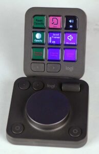 The other important thing to consider is that buttons for certain functions are the only way to use the dial to adjust those values, so you need a way to get to certain functions, even if it is a few pages deep. Due to this, I added pages of framing and color options at the end of my quick access list, to make those adjustments possible with the dial. Many of those values I would prefer to adjust with my Loupedeck+, but I recognize that most users who download my profiles won’t have that option available to them. You can map buttons to go to other pages, or use the dedicated left/right buttons at the bottom to navigate between the pages. For Premiere, I chose to add some page buttons to the main screen, more to name the pages, and create an index, than because I wanted to access them without using the bottom buttons. But I couldn’t bring myself to make a button for page two, because the ‘right’ button is so close by. So I have a main page, a second page of UI controls, and then three more labeled pages of key controls, and two more extra pages of options left over from the defaults. I choose to identify buttons with an immediate result with dark text, while buttons that activate the dial to adjust values have light text. And buttons that lead to new pages in red text, to make everything clear and consistent. My After Effects profile follows the same pattern, but with fewer pages.
![]()
Connectivity
One other surprising issue to consider, that I hadn’t expected, is that it does require Bluetooth or a ‘Logi Bolt’ receiver to use the dial. I initially acquired the device in Miami during MAX, and immediately installed it on my laptop, via Bluetooth, without issue. But then I got home, and had an edit to do, which required the assets on my desktop workstation. My workstation, it turns out, doesn’t have Bluetooth, and the Logitech receiver for my mouse is a “Unifying” receiver, which ironically is incompatible with new “Bolt” products. All of my other wireless Logitech devices support Bluetooth or Unifying connections. When I get a new mouse, I usually install the receiver in my desktop, and then set my laptop Bluetooth as the secondary device, so I can easily switch between devices as needed. This dial controller does support switching between up to 3 host devices, but only via Bluetooth or Bolt, and a Bolt receiver is not included with purchase. Now it was only $10 to buy a USB Bluetooth controller on Amazon, but it took a couple days to arrive. 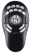 So for that edit, I dug out my Contour Shuttle Pro, and its double ring design does navigate the timeline quite well. But it does not allow you to use that analog input to control anything else, like opacity, crop, or transform values, which is where the MX Console really shines. So if you are only editing timeline sequences, a Shuttle type device might be a better choice, but most people are also color grading, doing motion graphics, and/or editing images in Photoshop and Illustrator. Those are the users who will benefit the most from buying an MX Console. Once my USB Bluetooth adapter arrived, I have been good to go with my MX Console on my main editing workstation, and I could easily switch back to the laptop by plugging the cable to the other system, and hitting the button on the bottom of the wireless dial.
Value
Technically, purchasing the $200 MX Console gives the buyer access to 3 months of Adobe’s Creative Cloud Software. That is valued at $60/month, for a total of $180, so if you are currently paying for Creative Cloud, you should be able to add this device to your inventory, for only $20 out of pocket once you utilize the savings. So that is a good deal.
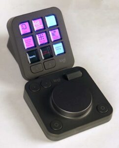 If you do buy one, my recommendation is to keep it simple. Setup your most frequent tasks on the first page of functions for each application, and then only add things when you find that you need them. Don’t add things that you can already easily do in a single click or keypress, unless it is something you otherwise forget. But I have setup pages for certain tasks, like coloring, or framing, so if I am doing a whole timeline of those functions, I can have dedicated pages of buttons for those tasks’ most frequent commands. The Action ring requires the mouse to select between functions, so don’t add anything there that you can already do easily with the mouse. Honestly I have mixed feelings about the action ring in general, but I am sure some users will love it, especially if they are new to the apps, and haven’t built muscle memory using traditional methods. But there is no replacement for the analog input provided by a dial, for timeline navigation, volume, and image sliders. And this is a reasonably priced option for adding a dial with a lot of other potential functionality, especially if you are in multiple Adobe apps. It is more versatile than the Contour Shuttle Pro or the Loupedeck+, and much cheaper than the CT. So I recommend it for people who are trying to grow in their proficiency with the Adobe apps.

